How to Use Colour Psychology With Websites to Increase Conversions
A good website should be more than just an information portal — it should also be an integral part of your sales methodology, helping to compel your visitors to buy something from you, or at least get in touch.
There are many ways to ensure your website increases conversions, including making your website easy to navigate, ensuring your landing pages are relevant, and using a grammar check tool to fix mistakes in your content.
Another way to boost conversion rates is with colours. Colours are useful for more than fashion and interior design — as a salesperson, you can also benefit from learning how to use them the right way.
Let’s look at how to use colour psychology to improve your website and increase conversions.
Avoid colour clashing
Before we get into colour psychology, it’s important to keep in mind a critical factor in colour choice on your website: the content must be easy to read.
If visitors can’t or don’t want to read your content, then they are unlikely to convert. Instead, they’ll pogo stick to the next result in Google. Not only will you lose a potential customer, but this also will increase your bounce rate — which can harm your search engine optimisation return on investment (SEO ROI).
For backgrounds and text, avoid using colours that are too similar to each other. Text that contrasts with the background is easier to read. Also, avoid using too many bright colours, as they can make the screen unpleasant or difficult to look at, let alone read.
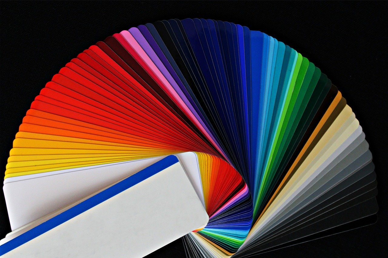
How to use colour psychology
We all know that different colours can affect our emotions — it’s why people paint their walls and decorate their rooms with furniture, curtains, and even custom tapestries in particular colours.
The same principle also applies to websites. Here are a few examples of colours and the effects they can have on your emotional state, as well as how you can use them to improve your site’s conversion rate.
Black
Black tends to give people a feeling of sophistication and luxury, so you will often find it as part of a colour theme on websites selling high-end, prestigious products. Examples include luxury perfume maker Chanel and luxury car maker Rolls-Royce.
White
White helps portray a sense of elegance and simplicity, making it suitable for many high-end products. It is also a neutral colour, meaning you can use it without the risk of turning anybody off. Another good reason to use white is that it draws your visitors’ attention to the products and other items on your site.
Green
Green is a nature colour — it reminds us of growth and life. That makes it great for selling health and wellness products, like essential oils, supplements, and superfoods. Green is also an ideal colour for companies that want to create an impression of being eco-friendly.
Blue
Blue is common on websites for professional industries, like finance. Such companies use it because it helps create a sense of honesty and security and can make people feel calm and trusting. However, the colour blue can also suppress appetite, which is why many businesses in the food industry avoid using it.
Orange
Orange is a welcoming colour that is linked to success, determination, and happiness. As a warm colour, orange infuses the room with energy and can encourage impulse purchases. The colour is best used for websites where people make direct purchases, such as ecommerce stores. Orange can also boost people’s appetite, making it a popular choice for fast-food restaurants.
Yellow
Yellow is another bright, positive colour that exudes energy, confidence, and cheerfulness. People who arrive at a website with a yellow theme will feel welcome, and are more likely to stay as a result. However, because yellow is so vibrant, it can sometimes be a bit overpowering, so it’s best to use it in moderation.
Red
Red is similar to orange, but more intense. The colour creates a sense of confidence and power and can provoke action (such as buying something). Red is often used alongside orange and yellow to make people feel hungry while also compelling them to make an order. Examples include fast-food giants Burger King, McDonalds, and Pizza Hut, who use red on their websites as well as in their logos.
Choose bright colours for CTAs
One of the most powerful conversion boosting features a website can have is the call to action (CTA). CTAs are effective because they compel people to take action, such as placing an order, joining a mailing list, or making a call. For example, CTAs are extremely important in restaurant website design if your goal is to boost online order profits. CTAs also help potential customers navigate your website by highlighting where they need to go next.
It’s best to use bright colours for the CTA to help it stand out. To be sure which colour works best for a particular CTA, it’s a good idea to use A/B testing.
Start using colour to boost conversion rates today
When choosing colours for your website, you need to research which ones will have the desired effect. For example, if you are in a professional industry like accounting, blue can help instil a sense of confidence and trust.
White portrays elegance and simplicity, while black will make your products and brand seem prestigious. Reds, yellows, and oranges are energetic colours that make people feel warm and welcome and compel your visitors to take action.
It also makes sense to consider your target audience before deciding which colours to use on your website. For example, if your target audience is young, lively colours like yellow and orange might hit the mark. On the other hand, if you’re trying to appeal to adults, colours like blue, black, and white are more likely to resonate.
You can always use Google to experiment and find out what works for you, and A/B testing tools are available that will help you check different colours against others and find out which ones drive more conversions. Tools like Google Analytics can also break down how well your site performs.
About the Author
Jamie Finch is a freelance writer with nearly two decades of experience. He left Britain in the year 2000 and headed East. He is currently living in Bangkok and writes on a wide range of topics, with a particular focus on SEO and marketing.